“CLEAN” DESIGN: Lean, Mean Selling Machine? Or Buying Barrier?
By Susan J. McIntyre
The Catalog Doctor™

Susan J. McIntyre, Founder
PATIENT: “Doc, I hear there's a trend today toward 'clean' design. Should I be doing clean design in my catalog? And what does 'clean' design mean anyway?"
CATALOG DOCTOR: “ 'Clean' typically means more negative space (aka white space), minimal copy, larger but fewer images per product, sans-serif type, often smaller point sizes and sometimes gray type instead of black. To see if clean is for you, let's look at where it works, where it doesn't work, and see some examples."
“Where does clean work?"
Clean works well in non-catalog venues like print ads and billboards where the goal is to grab attention and create emotional interest. Catalog environments have more requirements because they must sell directly. In catalogs, clean works best for products that people are buying primarily because they like the way it looks (like art).
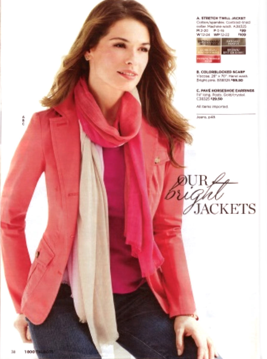
An example of clean is a recent Talbots catalog. Here's the complete copy selling a jacket: STRETCH TWILL JACKET Cotton/spandex. Contrast-lined collar. Machine wash. The jacket is shown full page, on-model. She's wearing a scarf and earrings which are line-listed. Although the jacket's features don't show very well in the photo, the overall impact is very attractive. 5 colors are shown via small swatches with color names overprinted. Small point size sans-serif type.
Talbots' technique will deliver sales primarily from customers who are completely comfortable making a buying decision based just on looks + price. Those who want a pocket count, or to know more about the cut or the length, won't buy. Or, if they're interested enough from the photo, they may go online to learn more (yes, there's more online) or go to a store if there's a store in their region. Those who are mildly interested won't bother to do either.
“Where does clean NOT work?"
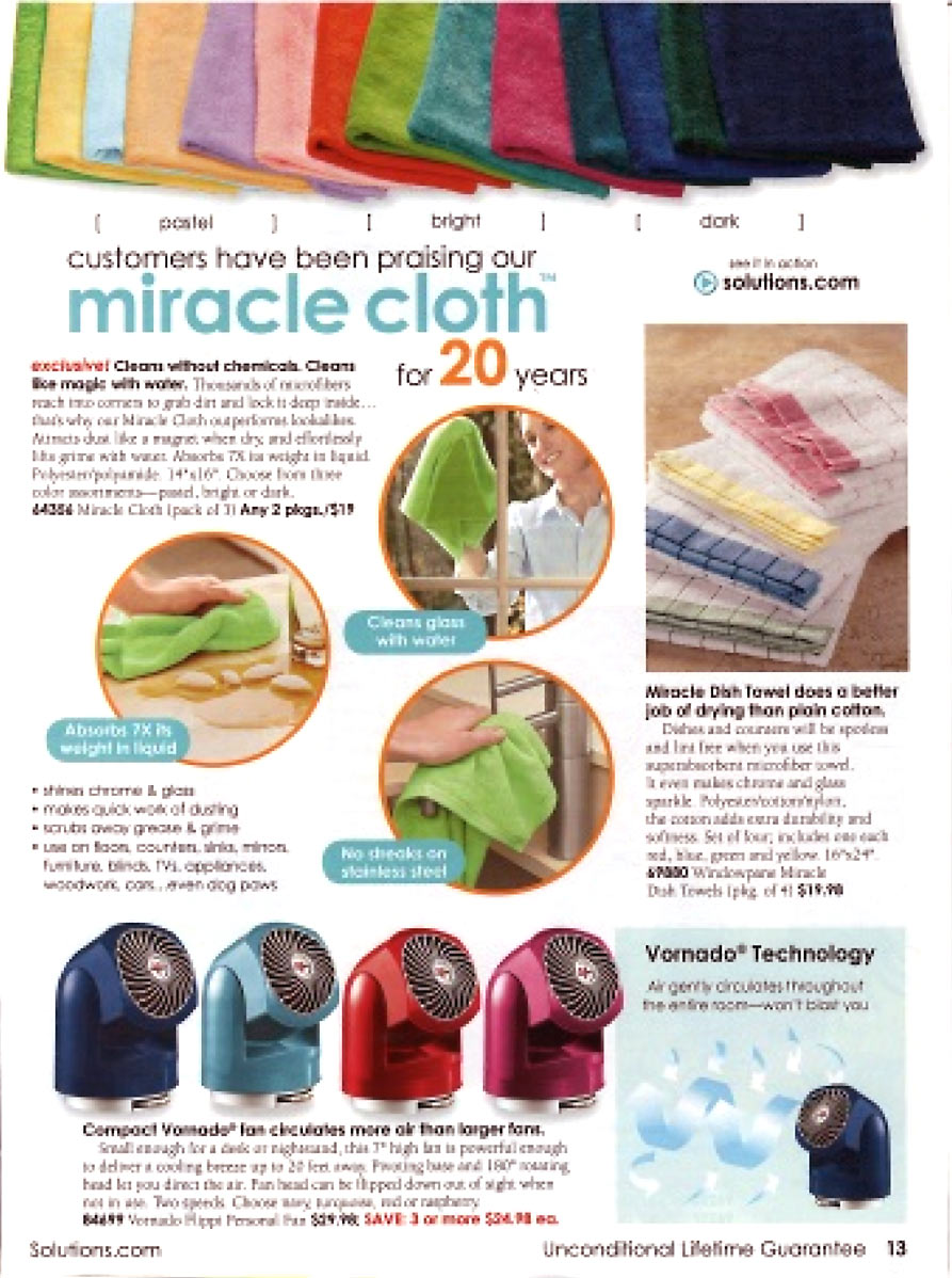
Clean does not work well for feature-filled products that require a lot of explaining. An example is the Solutions® catalog — an attractive, orderly catalog but with lots of selling elements (so not “clean"). Their iconic Miracle Cloth™ has 4 photos, a triple-deck headline, 3 photo captions, 4 callouts and 61 words of copy. This cover-all-the-bases selling technique is what typically gets great results for feature-filled products.
“How do I know what's right for my catalog?"
You need to think about your audience and the degree to which they ask questions before they are comfortable deciding to buy. Work with your customer service staff to find what types of questions customers ask to get an idea of how much your copy and photos need to answer.
Also take a look at what your competition is doing so you can see the expectations your shared customer universe likely has. If you're seeing your competitors using conventional copy and design, you should probably lean toward the conservative.
There's no longer a standard design/copy formula for all catalogs. There is a wide range to choose from. For your catalog, you may not want to go all the way to one end of the range or the other. But where in the middle do you go? Here's an easy way to test. Take just one 2-page spread. Design it 2 ways: your normal way, and a couple of steps in the direction you want to test (more clean, or more selling). Mail both, then compare the sales just of the products on that spread from the two different versions. That limited-to-2-pages test will give you confidence to evolve your catalog in the direction that tests the best, at a lot less expense than a complete catalog redesign.
“Clean" design is not for everyone. Clean depends on how much the customer/prospect needs to know in order to get the maximum number of customers to decide to buy. If they need to know a lot, you can't go with clean because clean will depress response too much. But if your customers buy mostly on appearance, you might want to give “clean" a try.
First published: RetailOnlineIntegration.com blog September 2013 © 2013 Susan J. McIntyre

